Thumbnails and details
Each asset is displayed in the Library Browser in one of two formats, depending on the view selected.
Because the icons of thumbnails view and the text records of details view represent the same assets, they have certain features in common. For instance, the context menu for assets is the same regardless of which representation is used.
Similarly, standard media assets (video, photo and audio), open an appropriate media editor when double-clicked. The corrections tools are also available when a media editor is invoked from the timeline, but when applied to a Library asset the corrections are carried forward into any future project that includes it. See Correcting timeline media for more information.
Details
In details view, each asset is presented as one line in a list of text records. In thumbnails view, it appears as a thumbnail image (for visual media types) or graphic icon.
To switch the Browser to details view, click the icon on the details view button  at the bottom of the Library. The arrow beside the button pops up a panel listing the optional columns available to be included in the text records (one column, Caption, is always present). Check the boxes beside any of these – File size, File type, Date, Tags, Rating and Duration – you wish to be shown.
at the bottom of the Library. The arrow beside the button pops up a panel listing the optional columns available to be included in the text records (one column, Caption, is always present). Check the boxes beside any of these – File size, File type, Date, Tags, Rating and Duration – you wish to be shown.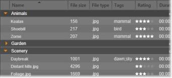
In Details view, each asset is displayed as a one-line text record. A pop-up checklist beside the Details view button lets you select which columns to show.
Thumbnails
The thumbnails view button  to the left of the details view button selects thumbnails view, in which assets are represented in the Browser by icons rather than text. The arrow alongside the button opens a pop-up checklist on which you can choose additional data to be shown with each icon. The options are Rating, Stereoscopic, Information, Correction, Collection, Tag, Used Media, Caption and Shortcut.
to the left of the details view button selects thumbnails view, in which assets are represented in the Browser by icons rather than text. The arrow alongside the button opens a pop-up checklist on which you can choose additional data to be shown with each icon. The options are Rating, Stereoscopic, Information, Correction, Collection, Tag, Used Media, Caption and Shortcut.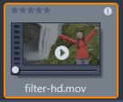 At the bottom center of most asset icons a preview button, a standard triangular play icon, is displayed when the mouse pointer is over the asset. The preview is shown on the Source tab of the Player panel.
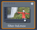 In either version of the Library, Alt-clicking the preview button will give you a mini-preview on the asset icon itself. With video and audio media, you can control the mini-preview manually by means of a scrubber that appears below the thumbnail whenever the mouse is over the icon.
If the asset is a photo, a pop-up preview button replaces the standard play symbol. Clicking it will display the photo in the Player panel.
When the Browser is in thumbnails view, a slider is available to control the size of the icons. You will find the slider in the bottom right corner of the Library. The icons can also be resized with the scroll wheel when Ctrl is pressed and the mouse pointer is positioned over the Browser pane.
Locked content indicator: Some of the Disc Menus, Titles, Montages, and other creative elements in the Library are locked to indicate that you do not own a license to distribute them freely. This status is indicated by the lock indicator.
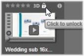
Even though locked, the content can still be handled as usual. A project containing locked content can be saved, put on a disc and exported.
However, a translucent ‘watermark’ logo will appear on the locked content.

The locked content watermark.
To purchase and unlock the content, use one of the following options:
• In the Library, click the lock symbol on the icon.
• During export of a project with locked content, a dialog will appear prompting you to click the lock symbol.